The Making of a Research Repository
- RoleLead product designer
- CompanyExlibris (Clarivate)
- ProductEsploro
- AudienceResearch institutions
The setup
The institutional academic domain is roughly divided between teaching & learning on one side, and the academic research on the other. Or at least that’s how the lion share of the budget gets
portioned. In between those are the academic facilitators, like the library, dean’s office etc. Exlibris is a long-time collaborator with the library, and been creating library-based products that get served across the institution, facilitating services like indexing and finding academic material, accessing subscriptions services, holding digital collections etc.
Two birds with one stone
Exlibris has previously ventured into the Teaching & Learning domain with products like Leganto, though, due to all kind of sensitivities, it has kept off the Research lawn. The corporate decided to take advantage of its strong ties with the library, and create a new product that addresses the research office and academic researchers as its primary user base, but catered by the library. This grants Exlibris a new footing in Research, while the library’s role in the institution grows.
Identify needs
Researchers, on the other hand, don’t have it easy at all when it comes to depositing their research material. Tools exist, though they tend to cover only some of the needs, and they often do so either too superficially and/or too laboriously. Moreover, research material is often stored arbitrarily by the researchers - once new research kicks in, older material often gets lost.
Disruptive product
For Esploro to stand out, it needed to have a top-dog repository, that:
- Reflects research impact to stakeholders
- Showcases research to public
- Deeply searchable by researchers
- Depositing material with minimal friction
- Generates researcher-profile showcases
That’s a handfull.
3 pillars were marketed as the foundations of Esploro - that will disrupt the market it competes in:
- Outstanding user experience
- Automatic harvesting of research data
- Quality metadata
The team
For 3 years as Lead Product Designer on Esploro I have worked closely with 2 product managers, 2 business analysts, 1 data scientist and a remote UX research team of 3. On the development side I worked tightly with head of development and the frontend team. Later the product scope scaled up, and I hired an assistant designer and a frontend developer, to help handle the component library and the design system.
The challenge
The same disruptive approach also created a major challenge for us: Not having the researchers as our direct clients (the library was), we knew we couldn’t access the researchers directly. We cautiously performed surveys amongst researchers, interviewing individuals outside our clientbase.
1. Tools pluralism
Surveys showed that researchers have no standard ways of working: from note taking and document editing to cloud storage and file sharing - everyone devised whatever tool was handily available and simply getting the job done. We had to account for such plethora of tools in our designs.
2. The bore
There was quite a consensus of opinions regarding existing tools that help researchers deposit their materials: boring, repetitive and verbose. Whichever way your turn it, researchers were somewhat deterred by this, resulting in negative engagement.
3. No steer
The nature of research work means that once funds are attained and the papers published, there’s very little interest, if any, to keep engaging with it. This is where the research office often steps in, to keep tending the garden. But even then much of the material gets either partially deposited or not at all.
4. Not another profile…
Most researchers maintain one or more online profiles where they showcase their research. It’s a chore to maintain multiple profiles, especially that different platforms offer different features. Esploro will add yet one more profile venue, which is a real bore.
5. Research output
The spectrum of types of research output is mind boggling. A system that will know how to handle all these types and correspond with established schemas is going to take some serious effort.
Prototyping
The deposit flow
At the crux of it, this is a complex form. The underlying intention was to make it easy on the eye, unintimidating, flexible and resumable form experience, which at first exposes the user to the minimum neccessary and none of the noise, yet invites to be gradually exposed to options at key places.
It’s a take on vertical stepper. But this proposal raised eyebrows with stakeholders. It threw them off thinking it’s too disorienting and did not capture the spirit of simplifying - at least not what they imagined or expected. I agreed wth them, and moved on to the next iteration.
This version was already prototyped in Angular2, the reason for which I will discuss in a dedicated blog post. Stakeholders were much more on board with this proposal. We ran it quickly with our development partners (clients) and they found it clear and engaging.
In line with keeping the form minimal, relevant fields are exposed to the user contextually. While this reduces noise (irrelevant fields) to minimum, it also brings the user’s attention to the appended fields as they get animated into the view following a clear, voluntary user action (i.e. selecting from a selection input).
Templates
Under the hood, the (reactive) form uses different templates that correspond with the type of material being deposited (article, dataset, images etc.). Once the key input of material type is being selected, the rest of the form changes.
In order to achieve the minimalism I was pushing for, I employed the use of a templates object. Each template registered which fields it should present, and also their respective text and labels.
{`"publication.journalArticle": [
    "asset_search",
    "files",
    "title",
    "authors",
    "topics",
    "description",
    "peer_reviewed",
    "status",
    "publication_details",
    "doi",
    "date",
    "languages",
    "grants",
    {
      "searchTemplate": {
        "title": "Search for your article",
        "description": "We'll try to grab as many details as we can from the selected publication.",
        "placeholder": "Article title, author, DOI or PMID"
      }
    },
    {
      "authorRoles": [
        "Creator",
        "Author",
        "Contributor",
        "Translator",
        "Other"
      ]
    },
    {
      "statusQuery": {
        "title": "What's the article's status?",
        "pubDate": "Publication date",
        "placeholder": "Select status",
        "statuses": [
          {
            "title": "Published (Final)",
            "pubTitle": "Where was it published?",
            "dateTitle": "Date published",
            "pubFields": [ "all" ]
          },
          {
            "title": "Accepted (post-print)",
            "pubTitle": "Where was it accepted to?",
            "dateTitle": "Date accepted",
            "pubFields": [ "all" ]
          },
          {
            "title": "Submitted (pre-print)",
            "pubTitle": "Where was it submitted to?",
            "dateTitle": "Date submitted",
            "pubFields": [ "all" ]
          },
          {
            "title": "Unpublished"
          },
          {
            "title": "Other"
          }
        ],
        "peerRevTitle": "Is the article peer-reviewed?"
      }
    }
  ]`}
This kind of form specificity is also a caveat: if the form is to account for every type and flavour out there, we would spend the entirety of our nouvelle product spirit just on this feature. So we turned to our dev-partners and distilled a list of most common material types - which is what we ended up starting with. Templates are also customizable by the Esploro admin, so they can be made specific to research cases.
Researcher profiles
Every researcher gets a profile page. Once a researcher claims a page, the page can either be edited, or left to get populated on its own by the Esploro algorithms and the admin. In either case it is publicly viewable.
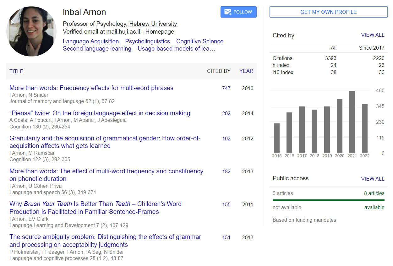
The design for the profile share much of the traits of many profile designs out in the wild. But the main focus here was to deliver a page that feels serious enough, without the taxation “serious” often incurs. By example, Google Scholar profile pages are highly popular and used by many researchers around the world. But a quick look is enough to see that the design is not there to create engagement, but merely to just get the job done.
To lighten up the page I aimed for increasing engagement with short animated transitions between the sections of the page. When switching between sections, we get a directional translation and fade of the contents, and a vertical transition when switching between sub-sections, as can be seen in the list of works. The directionality also helps reduce orientation disparity. Performance wise, having navigable sections allows breaking the data load to smaller parts, so we can hydrate data relevant to the visible section only,avoiding the complexity of data-blocking and incremental loading.
Signed in
As noted earlier, the researchers are not eager to maintain yet one more profile page. In line with this, I needed to introduce the least amount of friction to this newfangled profile page. Having the signed-in view almost identical to the public view ensures the user does not need to “learn” two different interfaces. Opting for the gradual exposure pattern, only a few call-to-actions and buttons are added to the UI, inviting the user to further interact and discover the tools available for authoring the profile.
The settings page available to signed in users follows a similar pattern of navigation between sections, only vertically this time. Settings modules can get pretty complex very quickly. With this in mind, I wanted future settings that will get added to follow the same pattern: Only call-to-actions invite the user to add data, and a short description of each section where a title is not sufficient.
I also wanted to keep everything concise and contained within the page. Although Dialogues (modals) are a common pattern for entering and editing content, here they would add orientational complexity, albeit small, and I needed to avoid any gram it. I opted for partly-inline editing. I created a component that opens any content in the same place where the call-to-action is, and I used it to place contextual forms. This pattern ended up everywhere in Esploro.
Interactions
Much effort was put on distilling and refining interactions to produce engaging and rewarding experiences that communicate the notion of “possible” and minimizes the notion “limited”.
Designing accessible interactions posed real challenge, but was never overlooked. The components receive an alternative interactive route, using the keyboard for example…
…and screen readers get informed of this.
Responsive
Every screen of Esploro is responsive, and none of the functionality gets omitted at smaller screens.
It was important for me to retain the level of granularity in the tree navigation, when changing from desktop to handheld screen sizes. This called for a complex horizontal navigation component - similar to breadcrumbs design, though each node (crumb) of the path becomes selectable, where relevant.
Caring for the B’s
Its the default disposition of the UX designer to care for the end user. But in a B2B2C product, caring for the business is, in fact, your primary goal. They are the buyers and they decide whether you product works for them or not. Every design decision has to be checked against the business and its needs. And there’s yet one more B in this triage - the business who makes the product - where you work. The product you are designing very likely rides on top an existing infrastructure (backend, cloud, indexing etc.), and your designs need to accommodate whichever limitations and flavours this brings. You also want to be clever about the task and minimize, where possible, new infrastructure development.
For example, to make it easier for the clients to implement terms and conditions in key places of Esploro, I created a component that takes straightforward HTML, parses all headers and generates anchor links. This allows asking the client for as simple an input as possible, and avoid having to develop dedicated backoffice screens for this text.
Public access
Being a B2B2C product, Esploro is intended to be customized, branded and dressed as the client’s product (customization is a big topic which I’ll discuss elsewhere). But the basis of Esploro is the same for all implementations.
The public facing aspects of esploro are meant to showcase research impact
- to tell the stories of and about research at the institution: display statistics, highlights, and news. Design wise, it is a pretty standard marketing-like structure. Where it gets interesting though, is where the visitors get to search or browse within the scholarly works, the researchers and the academic units.